Paper and DIY
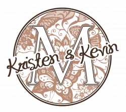 |
I fell in love with a monogram I saw on The Knot. I started playing around in PhotoShop to make one for myself and figured, why not make a tutorial at the same time?
You can download the tutorial here. |
 |
The term "word art" came from the digital scrapbooking world. Word art happens when you take a phrase, title or quote and use different fonts in different sizes and creative placement of words to make it look interesting.
This tutorial describes techniques to help you make beautiful word art you can use on your programs, invitations, etc. Download the tutorial here. |
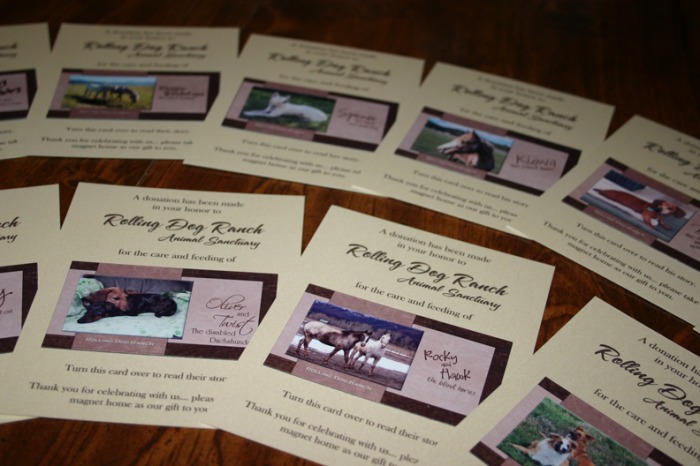
Donation Favors
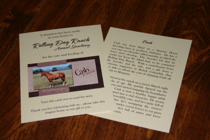
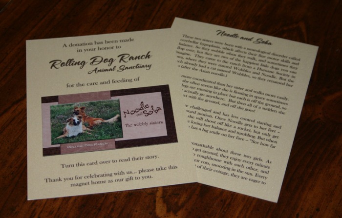
Originally I had wanted to do the monogrammed tins with jelly bellies in our wedding colors, but Kevin said he doesn't like jelly bellies. So, I ran the idea of donation favors by him, and he thought it was a good idea. My favorite charity is the Rolling Dog Ranch Animal Sanctuary in Ovando, Montana... they take in disabled animals when they have nowhere else to go and give them a forever home (or sometimes adopt them out if they find a worthy family.)
For the favors, I used left-over pearlescent cardstock from Paperandmore.com and business card magnet sheets from Magnetstreet.com. I attached the magnets to the card with removable glue dots.
I thought it would make it more personal to have the pictures of the animals (each person at the table will have a different magnet), so they can see who the donation is really supporting. Plus, they still have a favor they can take home and put on the fridge if they want (and who doesn't like a picture of a cute animal?) I have 12 different designs in all. The back of each card has a couple paragraphs of the animal's story -- what their disability is, where they came from, etc.
 |
 |
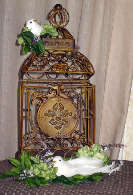 |
I got the bird cage at Hobby Lobby for 50% off and just used hot glue to add the flowers and birds. The top bird looks like he's getting ready to fall off in this photo, but it doesn't really look like that in person, LOL.
I propped the top of it open a little with the stem of one of the flowers (you can see it going crossways across the back of the cage) and hot glued it there. Then I wired it so that you couldn't open it any more. People could still reach their fingers in and take something because the cards will be leaning up against the side (it's not big enough for the cards to be laying down), but my mom volunteered to be seated near the gift table and keep an eye on it. |
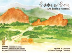
Save the Date Postcards
|
Our Save the Date postcards were made by ImagenThatDesign. We took a photo of our ceremony site and she painted it in watercolor and made the cards for us.
|
 |
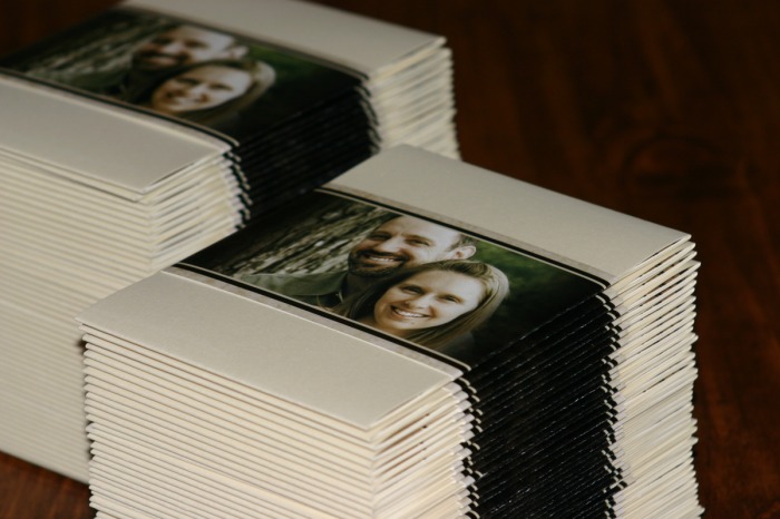
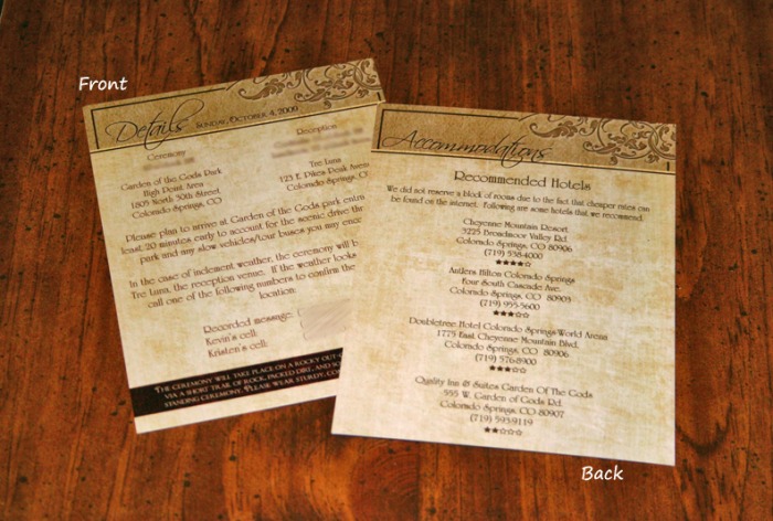
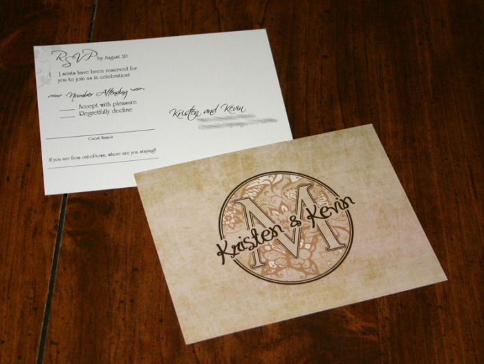
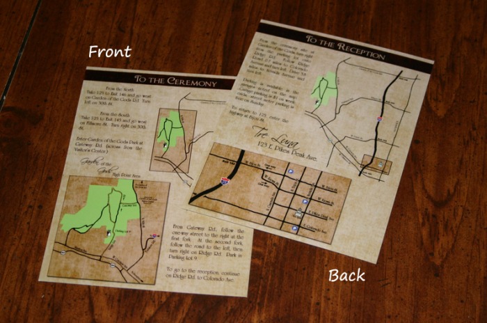
Invitations
 |
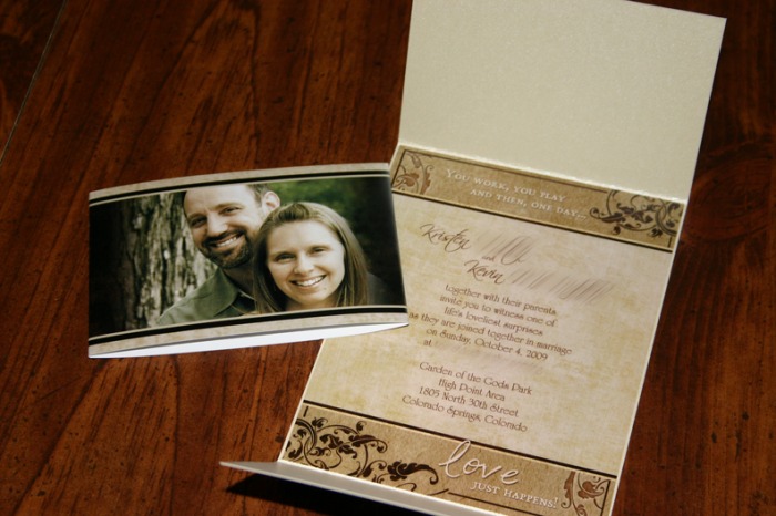 |
I used VistaPrint for my entire invitation suite. I used the standard size postcards for the invitation, and champagne pearlescent cardstock from Paper and More for a gate-fold card. The standard postcard is perfect A2 size, so I just cut the cardstock length-wise (well, Kinkos cut it for me) and then pasted the invitation in the middle and folded the top down and the bottom up.
I used the Vista Print flyers for the bellybands (3 to a sheet) and had Kinkos cut them.
I also used standard size postcards for the RSVP card and the inserts. The RSVP card has a black and white back. For the inserts, I paid for the full-color back, and they look great.
I used the Vista Print business cards for an insert with our website address, which is not shown here. I did have some issues with Vista Print, including inconsistency in color (see Vendor Reviews for a full review.)
  |
  |
Thank You Cards
All the photos used on my Thank You cards were taken by guests. I had some really talented guests!
I had these printed by Shutterfly. Unfortunately, even though it looked exactly like this on the preview, they cut the right side of the white border off during printing, so they looked kind of stupid. I ended up using my paper cutter to cut both white borders off completely on the sides and then it looked okay.
I had these printed by Shutterfly. Unfortunately, even though it looked exactly like this on the preview, they cut the right side of the white border off during printing, so they looked kind of stupid. I ended up using my paper cutter to cut both white borders off completely on the sides and then it looked okay.
This is on the top of the inside of the card. I loved this picture that his Aunt took... I loved the fact that you could see people and the photographer in the background so you could tell that it wasn't a staged photo. But with the people right behind us, it was distracting. I did some PhotoShop magic and I think it turned out kinda cool!
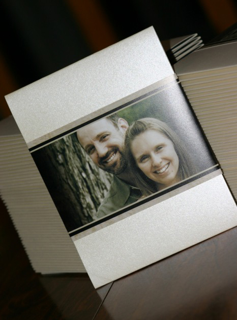
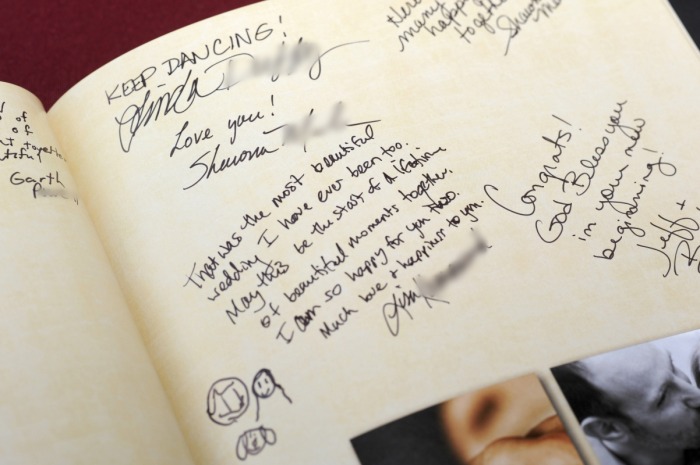
Photo Guest Book
 |
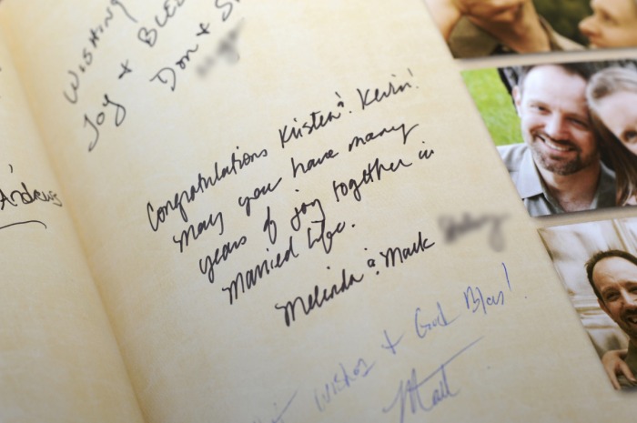 |
Table Numbers
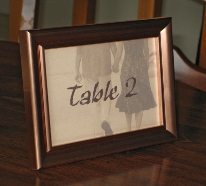
Bought the frames at the dollar store and printed on left over champagne pearlescent paper from my invites. I hadn't printed on the pearl paper for my invites (used it for the outer part of a gate-fold) so I wasn't prepared for how light the printing turned out to be. What was dark brown on my computer turned out to be a much more muted color when printed. But it still looks nice, so I decided to go with it.
Hershey's Minis
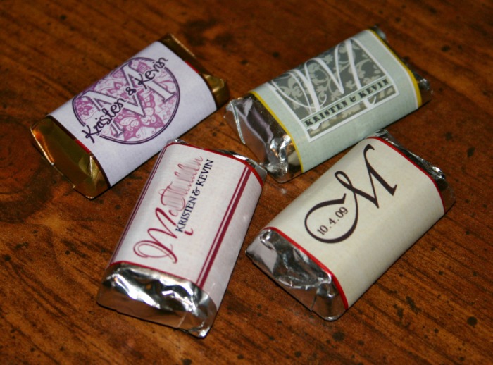
I used label #OL223 from Onlinelabels.com. They have two different sets of labels that claim to be fit for Hershey's minis... this one was just a hair too skinny to cover the entire colored part of the Hershey's label. Otherwise, the labels are great quality, glossy and print up beautifully.
Water Bottles
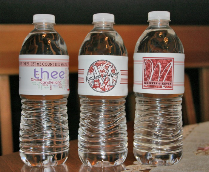
Bought the water-proof labels from Onlinelabels,com. They're good quality labels, but make sure you know which water bottles you are going to buy before you get the labels... luckily the ones I bought just barely fit my bottles. The labels that came on the bottles were quite a bit shorter. It's kind of a pain to get these labels on straight and smooth them out so they're not wrinkly.
I have three different designs -- two are monograms, and the third is a word cloud I made with Wordle using the text from Elizabeth Barrett Browning's poem, How Do I Love Thee? I'm not sure people will get it, but oh well... I know what it means.
I have three different designs -- two are monograms, and the third is a word cloud I made with Wordle using the text from Elizabeth Barrett Browning's poem, How Do I Love Thee? I'm not sure people will get it, but oh well... I know what it means.
Table Decor
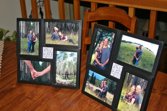
Will probably use these on the guest book table. Bought the frames at Walmart for $2.50 each. Our monogram is pasted in the middle of each frame.
Seating Chart
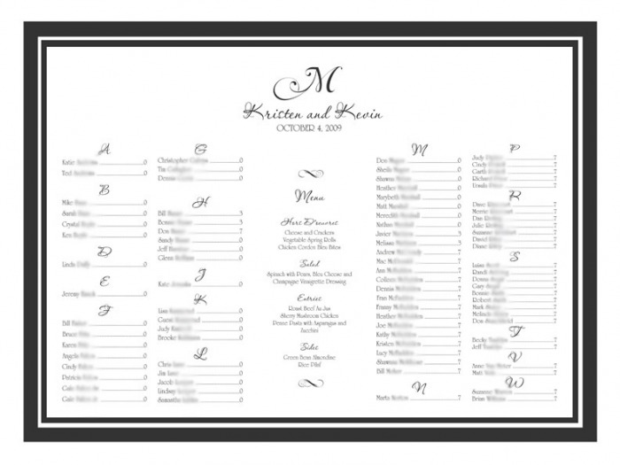
Wasn't as hard as I thought it was going to be, but still had to do a lot of playing around in PhotoShop to get everything right. I bought a black frame at Walmart for $12 and got the chart printed on paper at Kinko's for $5. Bought an easel off Amazon for about $11 which was cheaper than renting one, but the easel wasn't very good and the frame kept sliding off. We had to secure it with glue dots to get it to stay.
